The Centre-of-the-Frame Myth: How Contrast, Scale and Space Direct Attention
The centre of the frame does not automatically command attention. Learn how contrast, scale and surrounding space make an off-centre subject stand out.
The most common mistake in judging an image is to assume that whatever sits at its centre must be the main event. The centre-of-the-frame myth can cost a composition its intended emphasis: viewers may notice a small, bright object at the edge before they register the larger subject in the middle. Position matters, but it is only one part of how attention is directed.
Look at a photograph of a dark coat hanging against a pale wall. A bright red pin near the coat’s shoulder may attract the eye first, even if the coat occupies most of the frame. The viewer’s attention is not a cursor obeying a grid; it responds to differences, shapes and the way one element relates to the rest.
Position is only one cue
The centre can feel prominent because it is easy to locate and often receives deliberate placement. But an image has no single built-in centre of importance. A subject’s visual pull depends on what surrounds it, how it differs from nearby forms and whether its size makes it conspicuous.
Attention also shifts as a viewer looks. The first glance may land on a sharp highlight; a moment later, the eye may settle on a face or a line leading into the distance. An element can therefore be noticed first without remaining the most meaningful one.
It helps to separate three questions: what catches the first glance, what holds it, and what explains the scene. A coloured mark can catch the glance, a face can hold it, and the relationship between the face and a doorway can explain what is happening. Those roles may belong to different parts of the frame.
Contrast creates a signal
Contrast is a difference that stands out against a local background. It may be a shift from dark to light, smooth to rough, muted to vivid, or still to visibly active. A small feature with strong contrast can compete with a large subject whose tones and textures blend into its surroundings.
Local contrast matters more than a simple comparison across the whole image. A pale cup on a pale table may be difficult to pick out, while a grey handle against the cup’s bright body is easy to see. The handle is not necessarily the subject; it is simply an unusually clear signal within its immediate patch of the scene.
Edges can carry that signal too. A crisp boundary between a black umbrella and a light pavement may attract attention before the softer outline of a person in the background. If every edge is equally sharp and every colour equally vivid, though, the image offers many competing signals. Selective contrast gives the viewer a place to begin.
When an element is being overlooked, first ask what it shares with its surroundings. A modest change in tone or edge clarity may matter more than moving it towards the middle.
Scale changes visual weight
Large forms tend to command more space in the viewer’s field of view. A broad doorway can anchor a scene even when a small object inside it carries the story. Yet scale does not operate alone: a tiny, saturated badge on a plain jacket can draw the first glance, while the jacket remains the larger and more stable presence.
Relative scale gives meaning as well as prominence. A person made small by the surrounding room may seem distant, isolated or simply part of a larger setting. The same person, cropped close, becomes harder to ignore. Neither treatment is automatically more important; each asks the viewer to attend to a different relationship.
Size also affects how much detail an element can offer. A large face may be easy to locate but indistinct if its features are soft. A small, sharply outlined bird can be legible at a glance. The image’s hierarchy depends on what can be seen, not just on how much area an object occupies.
Space changes the balance
Empty-looking space is not necessarily inactive. A quiet patch around an object can separate it from nearby forms, making its outline easier to read. A small lamp against an uncluttered wall may feel more prominent than a larger lamp surrounded by shelves, framed pictures and bright packaging.
Space also affects how an element seems to lean or move. A person positioned near the right edge, facing left into open space, may appear to be looking into the scene. Turn the person towards the edge and the same placement can feel compressed, as if the frame has little room for the gaze to travel.
Surrounding forms can point without being literal arrows. A row of chair backs, a folded sleeve or the diagonal edge of a table may guide the eye towards an off-centre object. Conversely, a bold shape between the viewer and that object can interrupt the route. The empty and occupied areas work together to make the path legible.
How do the cues interact?
Can a small object beat a large one?
Yes, if it has a clear contrast against its surroundings or sits in an unusually quiet patch. A large object can still matter more to the scene, but the small one may receive the first glance.
Does the centre ever help?
Central placement can make an object feel stable or deliberate, particularly when the surrounding forms are balanced. It is a useful compositional choice, not a switch that automatically makes the object important.
Why can empty space feel prominent?
Open space can isolate the object beside it and give its outline room to register. It may also direct attention towards a gap that separates two forms, making their distance part of the scene’s meaning.
What if viewers look in different places?
Different viewers bring different expectations and notice different details. A composition can still establish a broad hierarchy, but it cannot dictate every glance or make all viewers interpret an image in the same way.
Read the hierarchy in order
To analyse an image, begin with the first element you notice, then look for what keeps your attention there. Is it a bright colour, a sharp edge, a large shape or an isolated position? Next, identify the scene’s likely subject and ask whether the first signal supports it or competes with it.
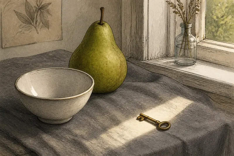
Imagine you are arranging a still life with a green pear, a white bowl and a small brass key on a grey cloth. If the key is the intended subject but disappears beside the pear, you could move it into a quieter patch of cloth or turn it so a clean edge catches the light. The expected observable result is that the key becomes easier to pick out, while the pear and bowl remain part of the scene rather than becoming distractions.
Then check the relationship between the subject and the frame. Does open space give it room, or does a nearby shape crowd it? Does a line lead towards it, or pull attention elsewhere? These questions are more useful than asking whether the subject is centred, because they describe what the surrounding image is doing.
Separate notice from meaning
Visual prominence is not the same as narrative importance. A bright exit sign may dominate a photograph of a quiet corridor, while the corridor’s repeating doorways explain its deeper structure. The sign announces itself; the sequence of doors gives the scene its larger organisation.
This distinction matters when editing, drawing or choosing a crop. If a secondary feature catches the eye first, it may be useful as an entry point—or it may distract from the intended subject. A crop that removes it can simplify the hierarchy, but may also remove context that helps the main subject make sense.
For a practical check, view the image at the size people are likely to encounter it. At a small scale, subtle tonal differences and fine detail may disappear, while a bold patch of colour remains conspicuous. At a larger scale, edges and small relationships become easier to read. Judge emphasis in the viewing conditions that matter, rather than relying only on a close inspection.
Design beyond the middle
The centre-of-the-frame myth is appealing because it offers a simple rule for a complex scene. In practice, contrast supplies a signal, scale establishes presence, and surrounding space shapes the routes between forms. Their combined effect gives an image its hierarchy, with placement acting as one cue among several.
When an off-centre subject needs to matter, look at the field around it before shifting it inward. Reduce competing contrast, give its outline room, or use a nearby line to direct the gaze. The centre is available, but it need not be promoted to manager of the whole picture.
The next time an image seems to have an obvious focal point, cover that element briefly with your hand. Notice what draws the eye in its absence. That small check can reveal whether the subject was truly carrying the composition—or merely standing in a convenient spot.