From Silhouette to Symbol: How Outline Carries Recognition
See how a distinctive outline turns a sign or picture into a recognisable symbol, and learn which contour details to keep when colour and texture disappear.
The common mistake in reducing a picture to a symbol is to keep its decoration and simplify its outline. That costs recognition: remove the colour and surface detail, and two different objects may collapse into the same generic shape. A strong silhouette does the opposite. It keeps the bends, gaps and protrusions that let the eye name what it sees.
Outline carries recognition because the boundary gives a shape a compact identity. This is why a teapot can remain legible as a flat black cut-out, while a carefully shaded blob may offer little clue about what it represents.
Contours before colour
Colour can help distinguish neighbouring symbols, but it is a fragile identifier on its own. A red shape viewed in poor light, printed in monochrome or displayed against a different background loses that cue. Its outer contour remains available.
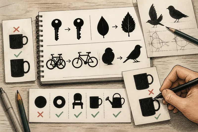
Look at a familiar sign as a filled-in shape rather than as a drawing. A bicycle symbol depends on two round wheels, a small frame and the recognisable arrangement between them. If the wheels become uneven or the frame joins into a single mass, a viewer may see an abstract tangle instead.
When sketching an icon, fill it with one dark tone and remove internal marks. If it stops reading, adjust the boundary before adding detail.
Keep the telling bends
Not every contour point matters equally. The broad outline of a key has a shaft and a toothed end; a few notches can carry more identifying weight than polished shading along its length. A leaf often needs its taper and a hint of its uneven edge. Smooth both away and it may become a drop or an oval.
These useful features are not necessarily the smallest ones. They are the places where the contour changes in a way that separates one plausible object from another: a handle opening, a pointed tip, a stepped edge, or a gap between parts.
For a quick comparison, draw two versions of a shape: one with a smooth, regular boundary and one with its characteristic irregularities. The more recognisable version usually has a few purposeful departures from simple geometry, not a great many fussy bumps.
Silhouette and symbol?
Why can a black silhouette be recognisable?
A silhouette preserves the boundary and the arrangement of large parts while discarding colour, texture and most internal detail. Those remaining relationships can be enough to distinguish a familiar object, provided its outline includes features viewers associate with it.
What makes an outline distinctive?
Distinctiveness comes from the contour features that separate an object from near alternatives: a handle, a forked end, a narrow neck or an unusual gap. A plain circle is easy to see but difficult to identify without additional shape information.
Should an icon include internal lines?
Include them when the outline alone leaves two likely readings and a small mark resolves the ambiguity. A door symbol might need a line to indicate its opening, for example; extra seams and shading may add visual noise without clarifying the object.
How can I check a symbol at small size?
View it as a single-colour shape at the size where it will actually appear, then check that its main parts remain separate and its distinctive contour survives. If a gap closes or a protrusion vanishes, simplify or enlarge that feature rather than adding texture.
Gaps are part of shape
An outline is not only the edge around a solid form. Openings and spaces between parts help define the object too. The hole in a ring, the space under a chair seat and the opening inside a handle can be as useful as the material around them.
Imagine a designer making a small symbol of a mug. In the first draft, the handle opening is so narrow that it closes when reduced; the mug then resembles a plain cup. Widening the opening and separating the handle from the body makes the expected distinction visible, without adding a coloured handle or a drawn highlight.
Check the empty areas as carefully as the filled ones. If they disappear at the intended viewing size, they are not doing their share of the work.
Choose detail by distance
A symbol on a distant sign has less room for delicate contour changes than a large illustration on a page. The answer is not automatically to make every edge round and blunt. Preserve the most identifying bends, then remove small irregularities that merge into visual clutter at a glance.
For example, a simple bird mark may need a beak, a body and a clear separation between tail and wing. Feather notches can be dropped if they make the edge look ragged at a distance. A symbol for close viewing can carry finer distinctions, as long as they clarify rather than merely decorate.
Check the outline at its intended size and viewing distance; a detail that works enlarged may disappear in use.
Test the outline alone
Before choosing a colour palette, make a plain filled version of the proposed symbol. Compare it with nearby shapes that could be mistaken for it, not only with an idealised drawing of the intended object. If the outline reads as a different familiar thing, change the contour or add one restrained internal cue.
Say you are drawing a watering can. A rounded body and long spout may already suggest the object; a small handle loop can make the reading clearer. If the loop merges into the body, opening that gap is more useful than adding a painted stripe.
The best outline is not always the most realistic one. It is the one that keeps the right distinctions visible when the rest of the picture falls away. Outline carries recognition most effectively when each retained edge has a job, and the empty spaces are allowed to do theirs as well.